


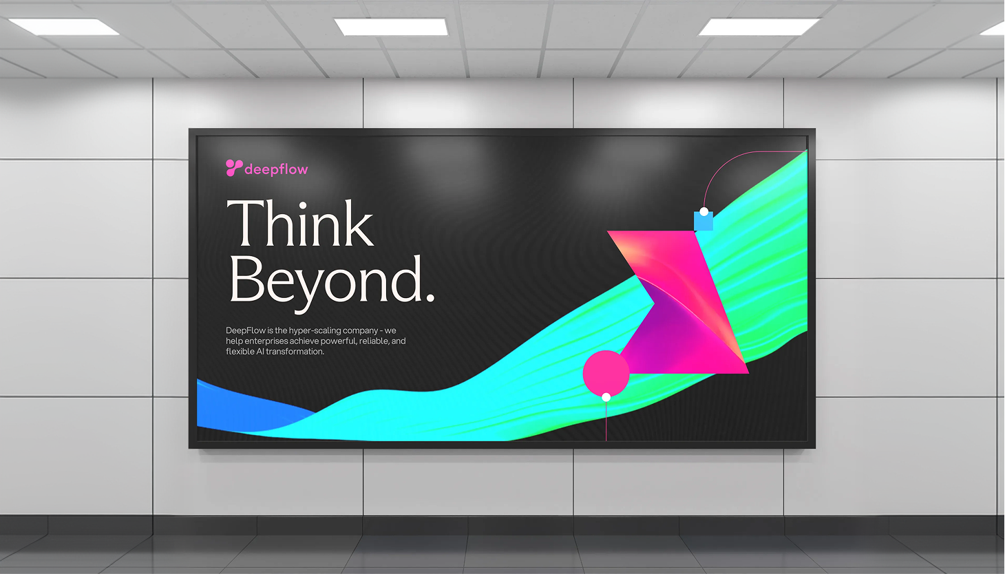
Orchestrating AI Transformation with DeepFlow
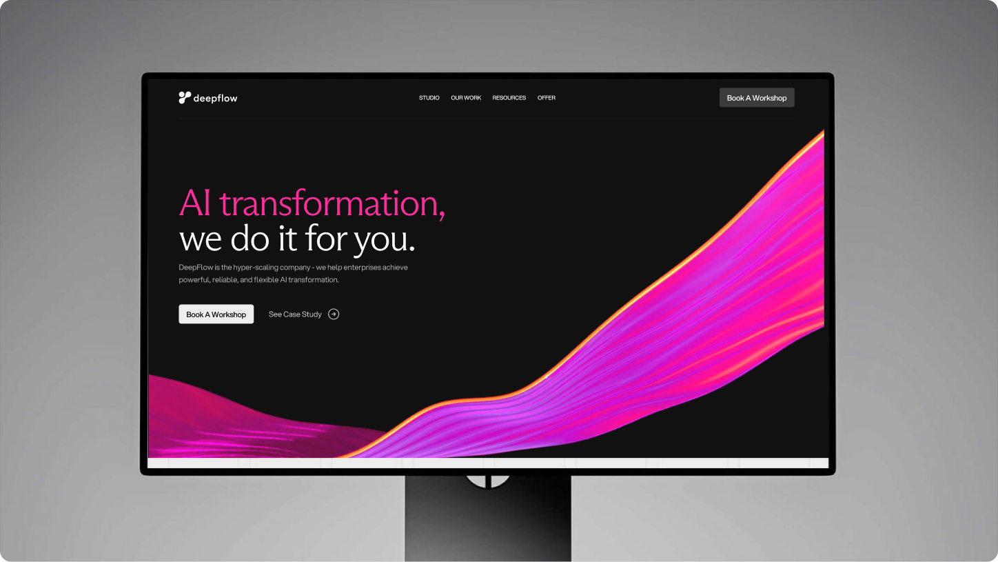
DeepFlow exists at the intersection of human intelligence and artificial intelligence. Positioned as a hyper-scaling partner, the platform helps enterprises integrate AI into their workflows without losing governance, oversight, or strategic direction.
We were tasked with building a brand that reflected both velocity and structure, capturing the energy of AI-driven acceleration while reinforcing trust, maturity, and control. The challenge was to move beyond typical tech aesthetics and instead create a system that felt authoritative yet approachable, bold yet governed.
The visual system was built around the idea of flow. Fluid and glass-like, it reflects DeepFlow’s philosophy of seamless AI orchestration guided by structure and control. We created two distinct gradient elements that express movement, depth, and directional clarity.
These gradients are not decorative but foundational to the identity. Their motion suggests velocity and transformation, while their translucency conveys layered intelligence and governance. The broader color palette was derived directly from these elements, ensuring a cohesive and system-driven visual language that feels modern, intentional, and controlled.


Shaping the Design System
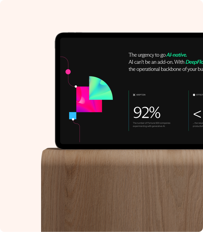
Building on the gradient foundation, we developed a cohesive system of typography, colour, and graphic elements. Arizona Flare introduces authority and refinement, balanced by the clarity of Aspekta and the precision of Geist Mono for technical touchpoints.
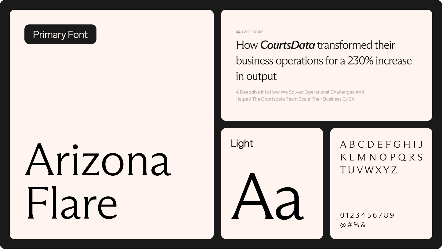
The final palette was drawn directly from the gradient spectrum and grounded with Slate and Chalk to provide clarity and balance.
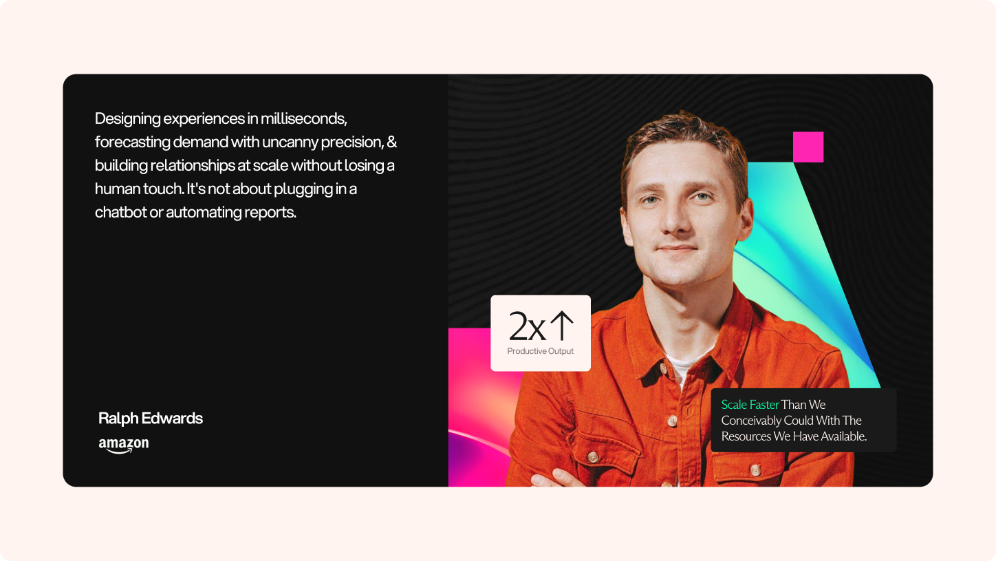
Alongside this, we developed a modular element system designed to integrate seamlessly with human imagery. These forms allow real people to sit naturally within the visual language, creating compositions where technology and humanity coexist. Together, this system introduces warmth and relatability while maintaining the structured precision of the brand.


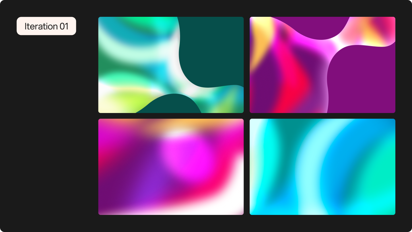
Evolving the Language of Flow
The gradient system underwent multiple explorations before arriving at its final expression. Early iterations tested varying levels of abstraction, colour intensity, and depth to understand how fluidity and structure could coexist within the same frame. Each iteration refined the balance between movement and control, ensuring the visual language felt intentional rather than ornamental.
Through this process, the gradients evolved from expressive experiments into a disciplined system. The final direction retains the sense of motion and dimensionality established at the start, but with greater clarity, cohesion, and scalability across touchpoints.
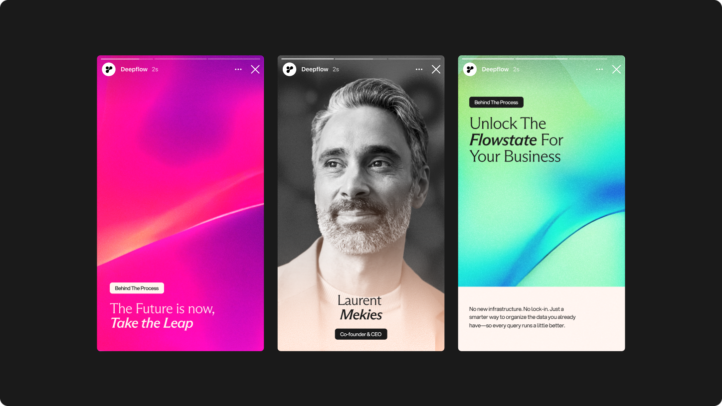
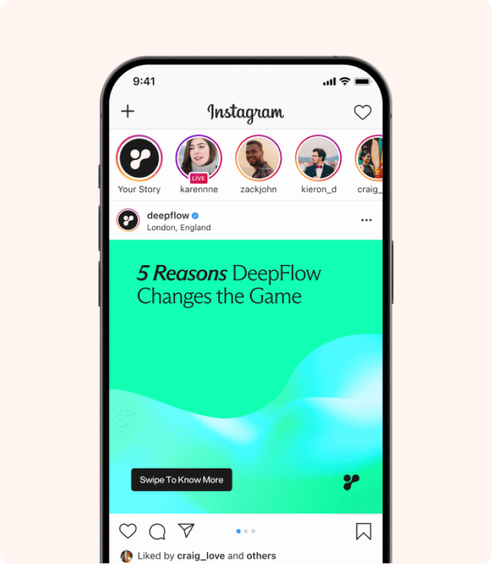
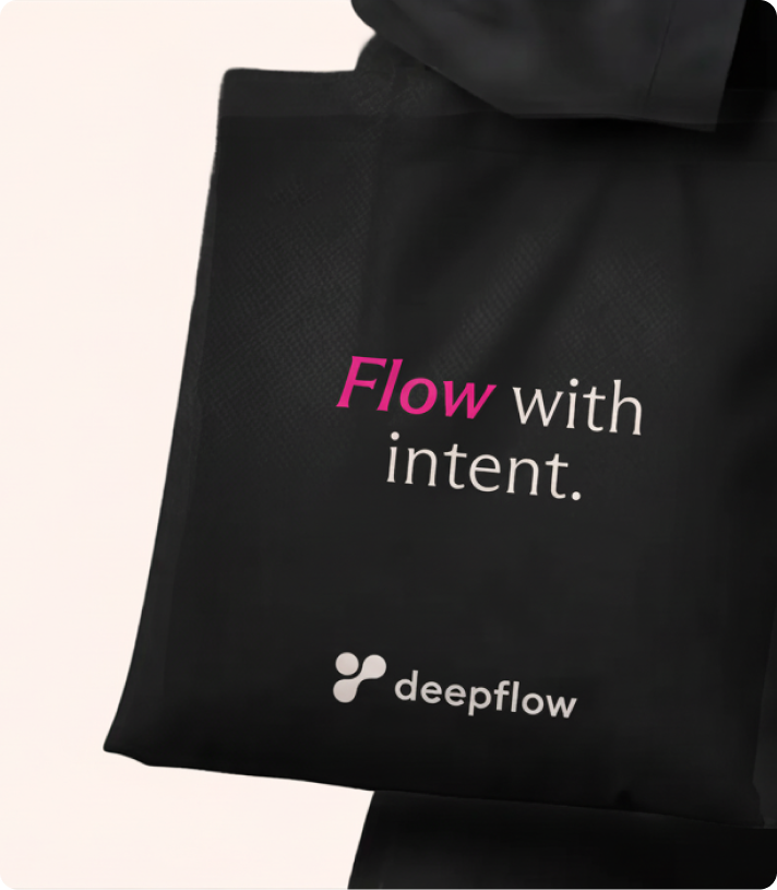
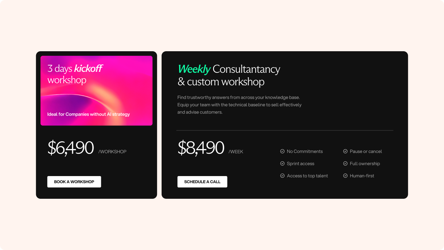
Bringing the System to Life
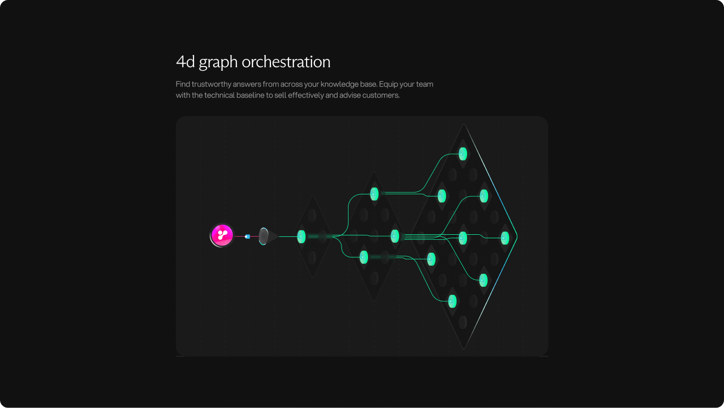
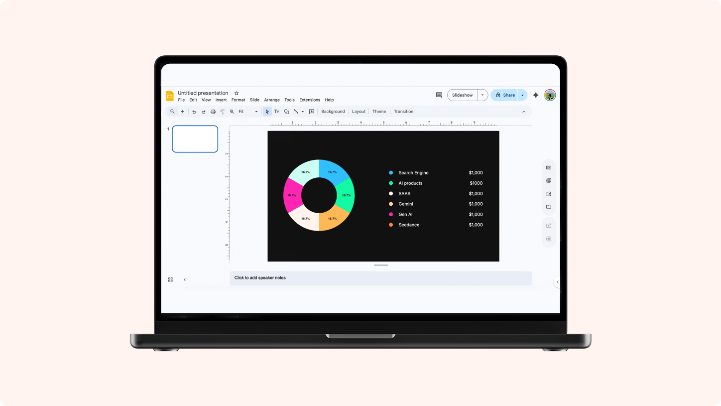
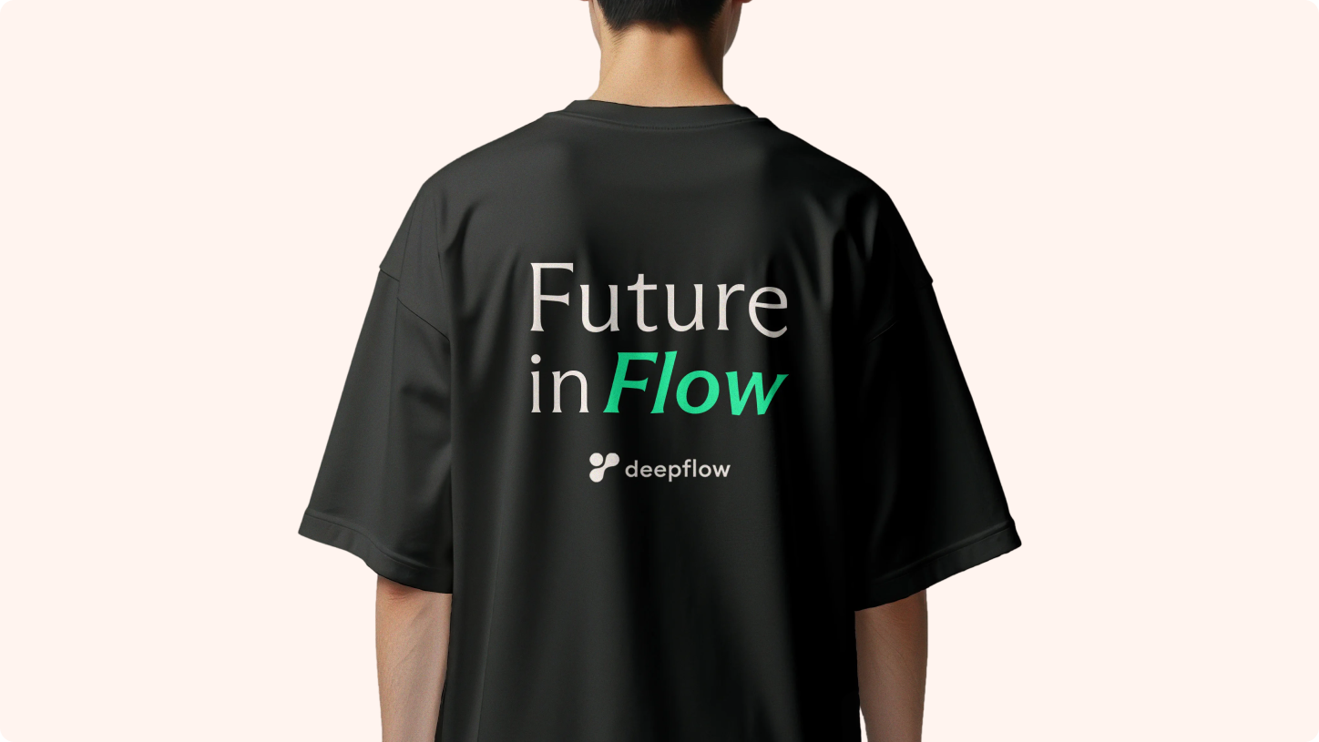
With the identity defined, we translated the visual system across digital and physical touchpoints to ensure consistency at every scale. From website pages and pitch deck templates to social assets and branded collateral, each application demonstrates how the gradients, typography, and structural elements adapt seamlessly across contexts.
The result is a cohesive ecosystem where strategy and design work in tandem, allowing DeepFlow to present itself with clarity, confidence, and continuity across every interaction.


An evolving stage for India's tech future
SiliconHalli embodies a new era of innovation, where local culture and global vision converge. This identity isn’t static—it evolves with the city’s growing tech ecosystem, reflecting the energy and resilience of the community it represents. From its bold visual language to its adaptable applications, the SiliconHalli brand is designed to grow alongside the groundbreaking ideas it hosts.
As Bengaluru shapes the next chapter of India’s technology story, SiliconHalli stands as a testament to what’s possible when creativity meets purpose—a brand built for today, but with its sights set on tomorrow.


%20(1).png)

%20(1).png)

.webp)