


Algorithms Inspired by Art

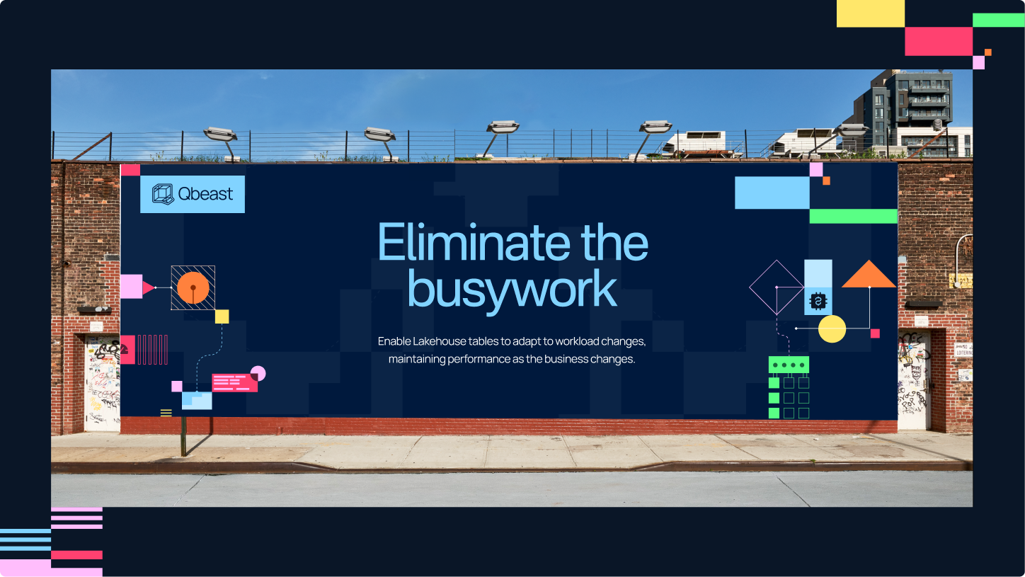
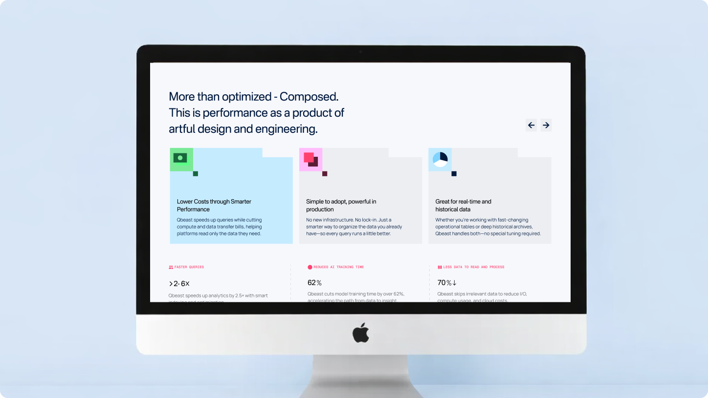
Qbeast operates at the intersection of large scale data infrastructure and high performance computing. Positioned as a seamless performance layer for modern lakehouses, it enables enterprises to accelerate analytics without changing their existing tools, formats, or workflows.
We were tasked with building a brand that could translate deep research and patented indexing technology into something clear, credible, and compelling. The challenge was to express measurable performance gains without relying on hype, and to create a system that felt precise yet human, technical yet accessible. The result needed to reflect quiet confidence, structural intelligence, and effortless acceleration.
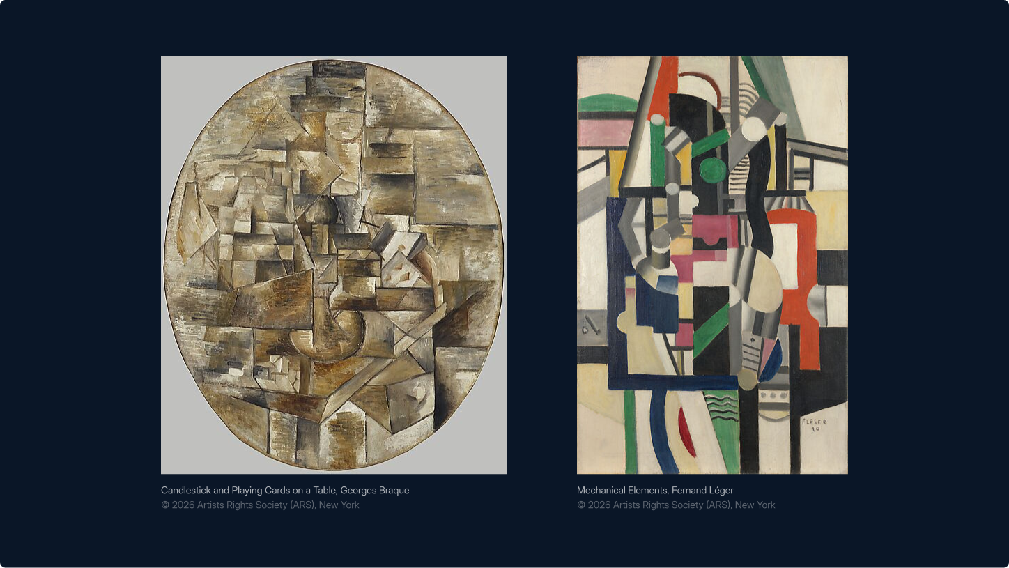
Reframing Complexity Through Cubism
Cubism became the conceptual foundation for Qbeast’s visual identity because it mirrors how the technology approaches data. Early Cubist artists challenged traditional representation by breaking subjects into geometric fragments and reassembling them from multiple perspectives. Rather than depicting reality as a single viewpoint, Cubism revealed deeper structure through abstraction and layered interpretation.
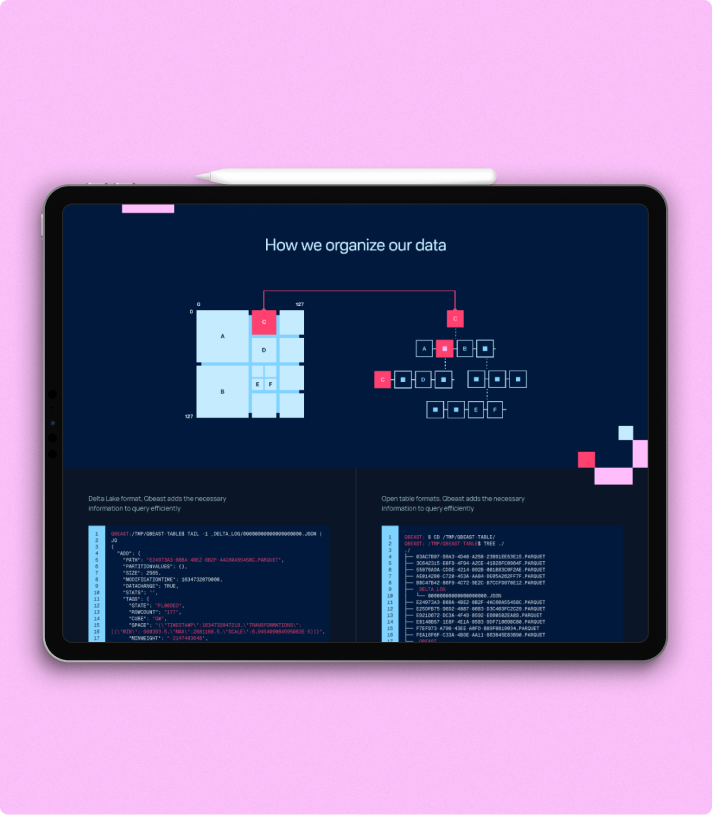
Qbeast operates on a similar principle. Instead of scanning entire datasets sequentially, its multidimensional indexing restructures how data is organized and accessed. By analyzing information from multiple angles, the system reveals patterns and insights that would otherwise remain hidden.
This parallel between artistic perspective and technical architecture made Cubism a natural metaphor for the brand. Just as Cubist painters deconstructed form to expose underlying meaning, Qbeast reorganizes complex data structures to uncover insight, improve performance, and enable teams to see their data differently.
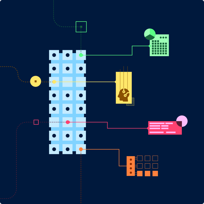
The visual system translates Cubist thinking into a structured design language. Inspired by geometric abstraction, forms are deconstructed into precise shapes and layered compositions that reflect multidimensional structure. Cubes, segmented planes, and angular arrangements echo the idea of viewing a system from several perspectives simultaneously.The logo was crafted with duality in mind, seamlessly transitioning between English and Kannada. This dynamic motion became a hallmark of the identity, symbolising Bangalore’s bilingual reality and its role as a bridge between local and global cultures.
The visual system translates Cubist thinking into a structured design language. Inspired by geometric abstraction, forms are deconstructed into precise shapes and layered compositions that reflect multidimensional structure. Cubes, segmented planes, and angular arrangements echo the idea of viewing a system from several perspectives simultaneously.
Across the website and brand materials, illustrations, patterns, and visual metaphors consistently follow this geometric logic. The result is a cohesive visual system that reflects Qbeast’s core philosophy: transforming complexity into clarity by restructuring how information is observed, organized, and understood.

Balancing Depth and Energy
Qbeast’s colour system is designed to balance technical depth with visual clarity. Anchored by Qbeast Blue, the palette conveys trust, precision, and quiet authority, reflecting the platform’s roots in high-performance infrastructure and research-led engineering. Qbeast Pink introduces contrast and momentum, bringing energy to the system without disrupting its sense of control. Together, they create a visual language that feels both structured and expressive.At its core, the identity revolved around the contrast between innovation and imperfection. Pixels, scribbles, and strikethroughs became the brand’s visual language, representing both the messy process of ideation and the humour inherent in big, lofty dreams.
A supporting tertiary palette extends this foundation across digital and physical touchpoints, adding flexibility while preserving cohesion. Used alongside the brand’s geometric forms and multidimensional compositions, colour becomes more than an accent. It helps communicate Qbeast’s core idea: transforming complexity into something clear, intelligent, and accessible.
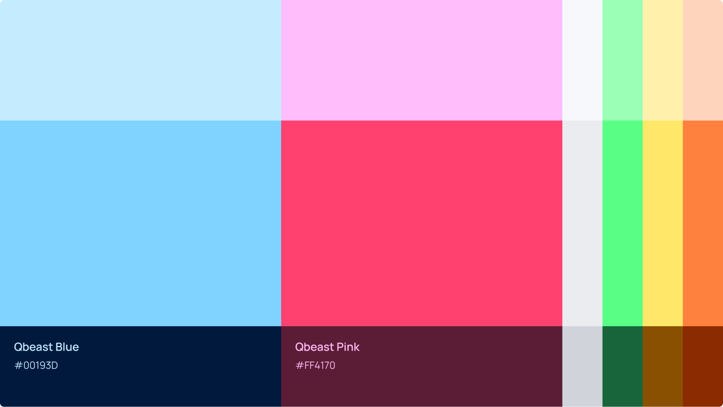
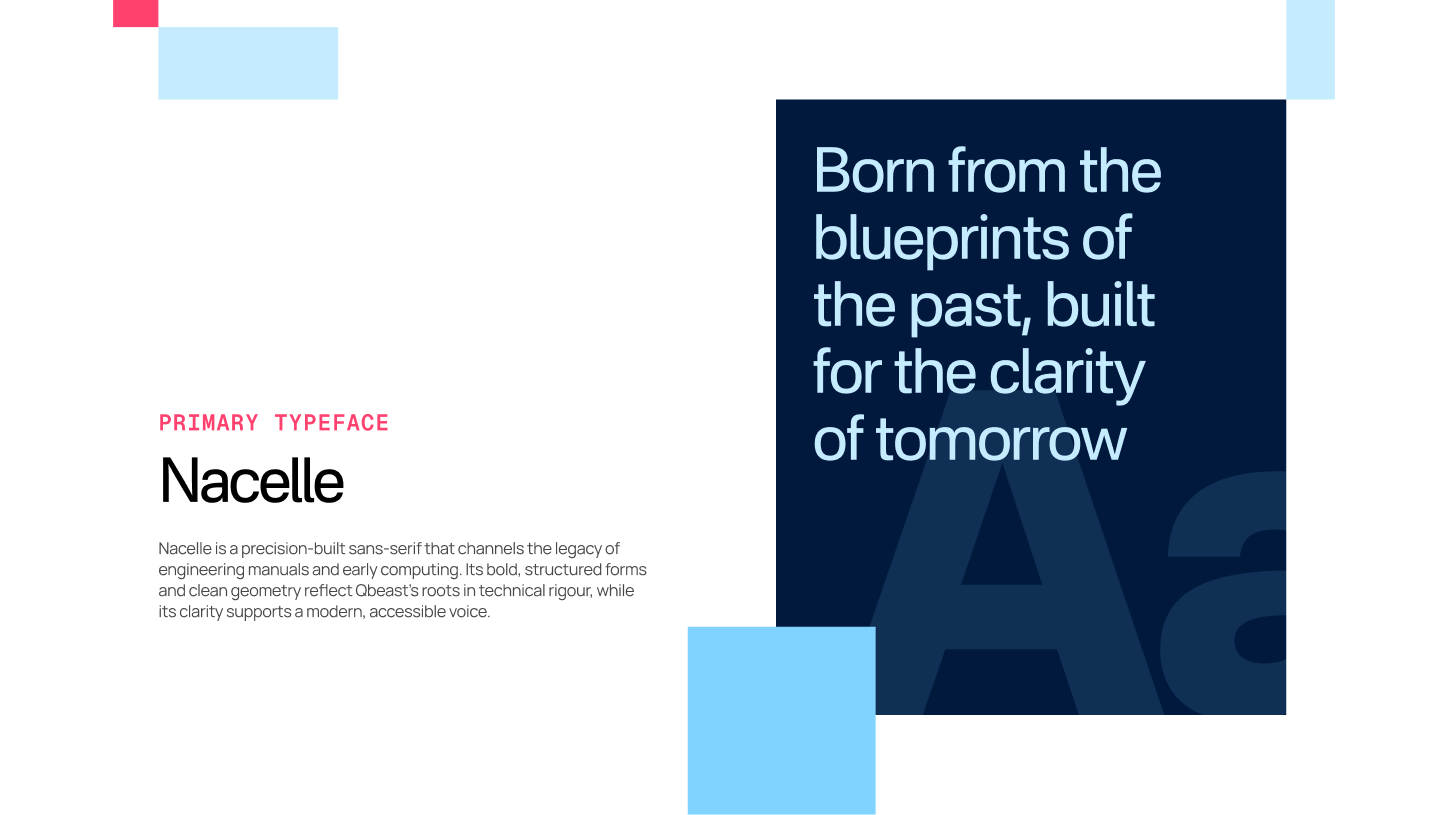
Typography reinforces this structure. Nacelle brings confidence and modern clarity to headlines, Manrope ensures warmth and readability in body copy, and Geist Mono provides precision in technical contexts. Together, these elements create a visual language that is intentional, scalable, and aligned with Qbeast’s promise of speed, structure, and clarity in complex data environments.
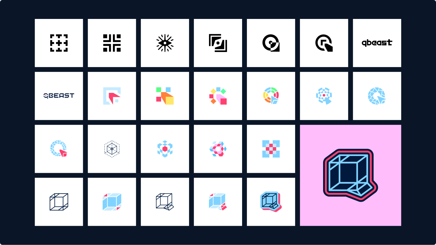
Constructing the Qbeast Mark
The Qbeast logo is built on clarity, structure, and multidimensional thinking. Derived from the relationship between the letterforms Q and b, the final mark also draws on the dimensional logic of a tesseract, resulting in a form that feels precise, layered, and intentional.
Its geometry reflects Qbeast’s core philosophy: transforming complexity into something structured, efficient, and clear. The logotype supports the symbol with confident, contemporary letterforms that balance technical credibility with approachability. Together, they form an identity that captures Qbeast’s blend of deep research, engineered performance, and thoughtful design.

Initial logo concepts explored during the brand development phase.
At the core of SiliconHalli’s identity is a pixelation tool we built to transform raw visuals into cohesive brand imagery. The tool generates pixelated outputs in both PNG and SVG formats, with options to adjust the level of pixelation. A key feature is its ability to remap images into SiliconHalli’s signature brand palette, allowing each pixel to align with the closest brand color. Additionally, sliders enable precise control over how much each color contributes to the final image. The result is a flexible system that shapes a unified aesthetic, anchoring the brand’s distinct visual presence across touchpoints
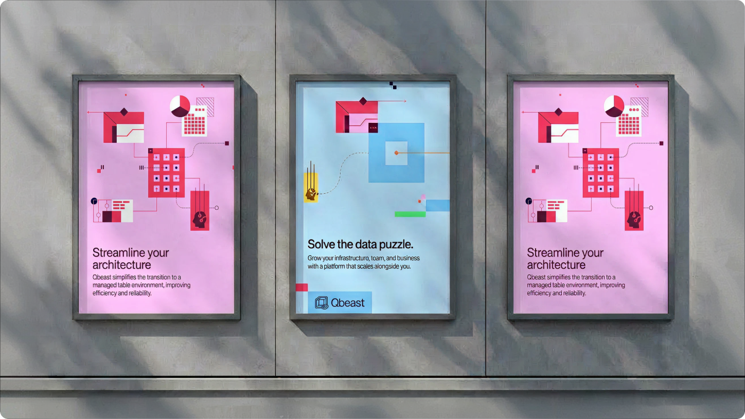
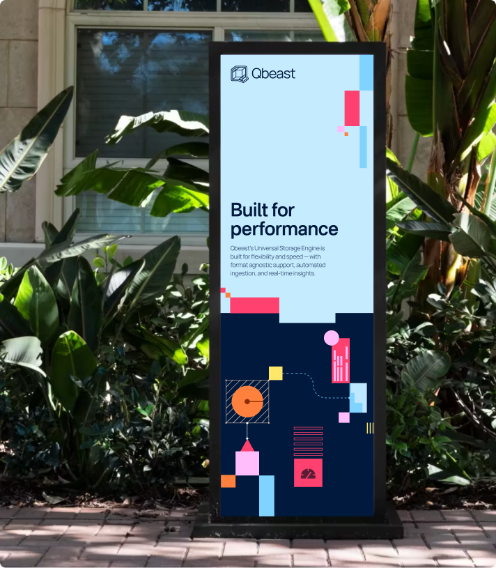
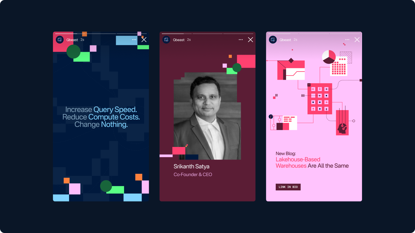
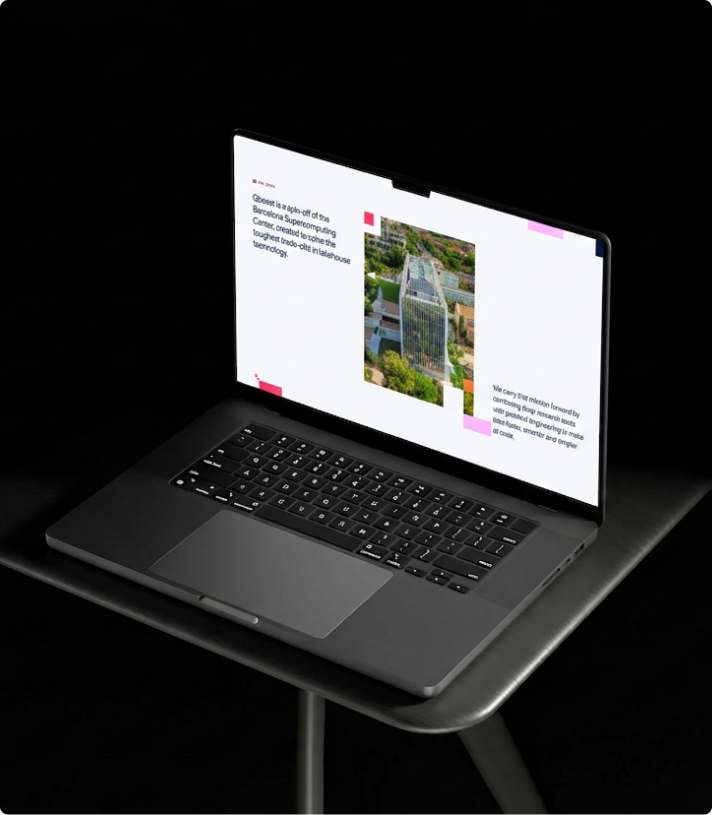
With the identity defined, the system was extended across digital and physical touchpoints to ensure consistency at every scale. From the website and product visuals to pitch decks, social assets, and branded collateral, each application demonstrates how the cubist patterns, typography, and colour system adapt seamlessly across contexts.
The result is a cohesive brand ecosystem where structure and expression work together, allowing Qbeast to show up with precision, confidence, and clarity across every interaction.

An evolving stage for India's tech future
SiliconHalli embodies a new era of innovation, where local culture and global vision converge. This identity isn’t static—it evolves with the city’s growing tech ecosystem, reflecting the energy and resilience of the community it represents. From its bold visual language to its adaptable applications, the SiliconHalli brand is designed to grow alongside the groundbreaking ideas it hosts.
As Bengaluru shapes the next chapter of India’s technology story, SiliconHalli stands as a testament to what’s possible when creativity meets purpose—a brand built for today, but with its sights set on tomorrow.


%20(1).png)

%20(1).png)

.webp)